Historian Application
Simaxx presents connected data using the Historian Application. The connected data is aggregated at the point of input to the platform. The historian app uses this functionality to quickly display data sets in a variety of appealing visualisations.
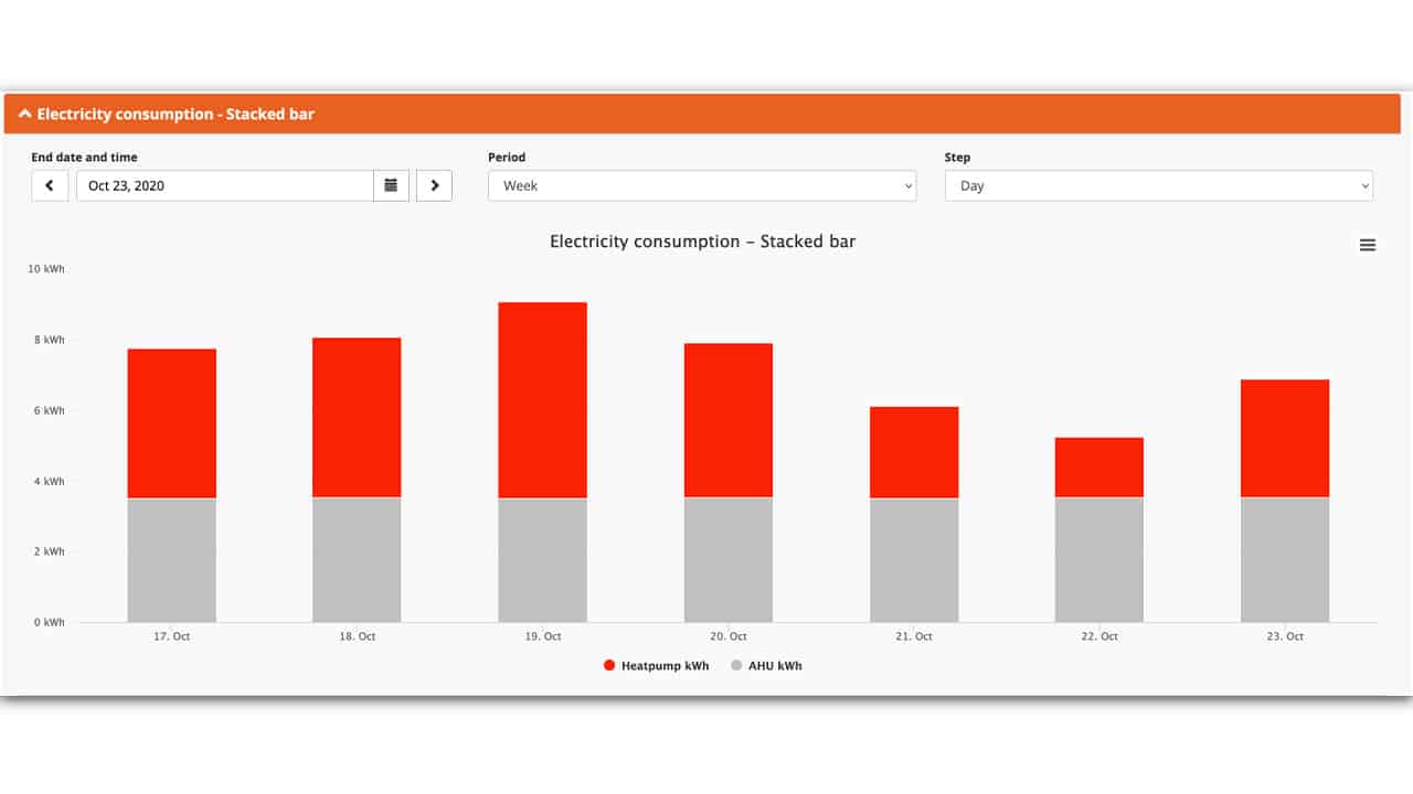
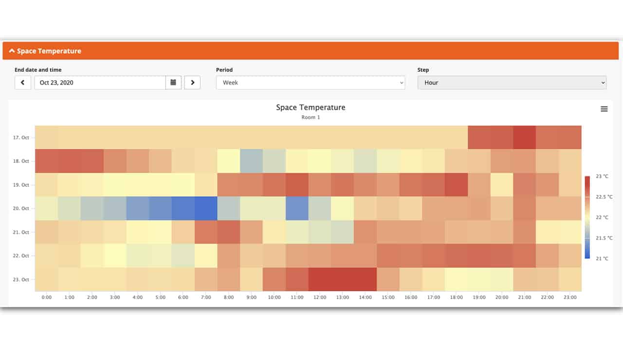
Data Period Selection
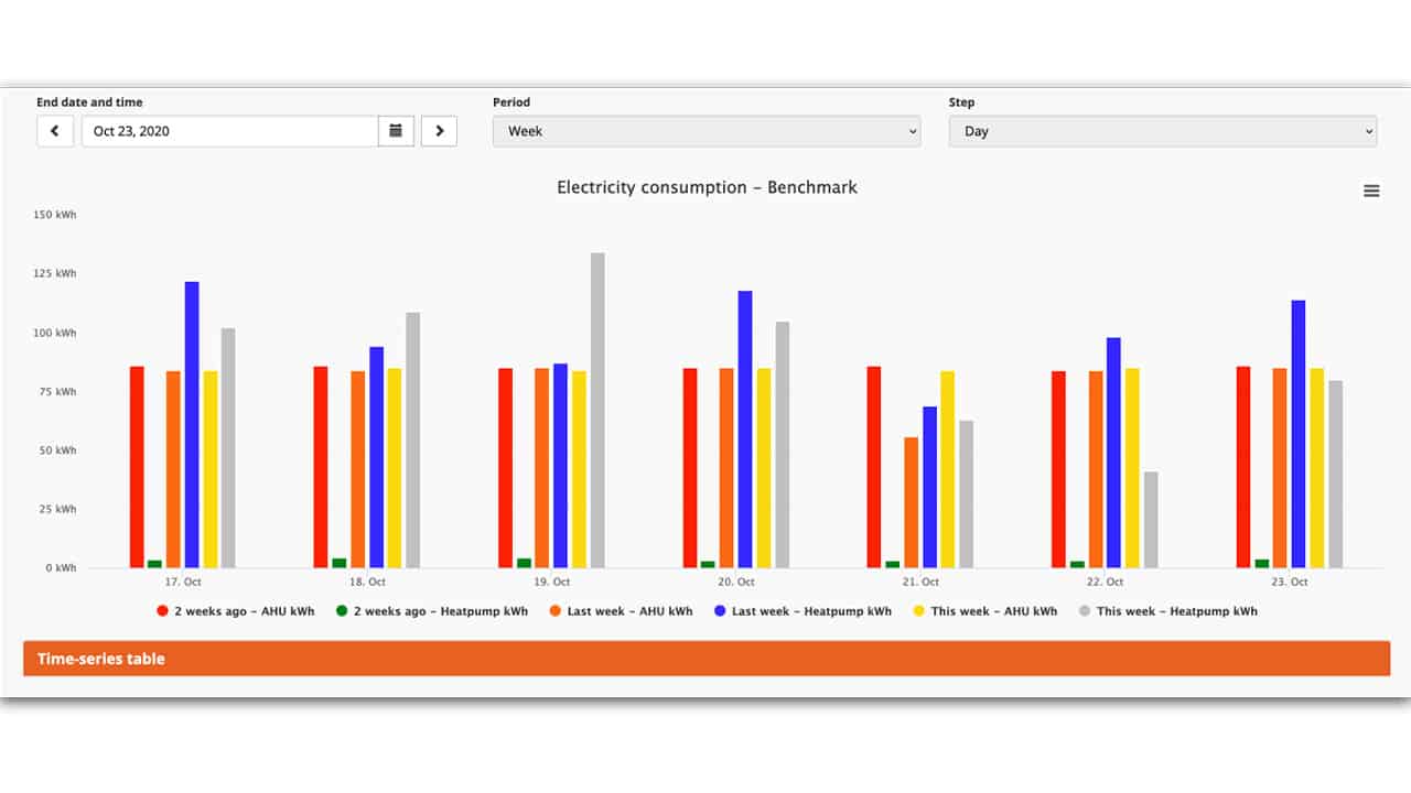
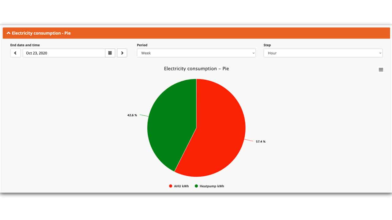
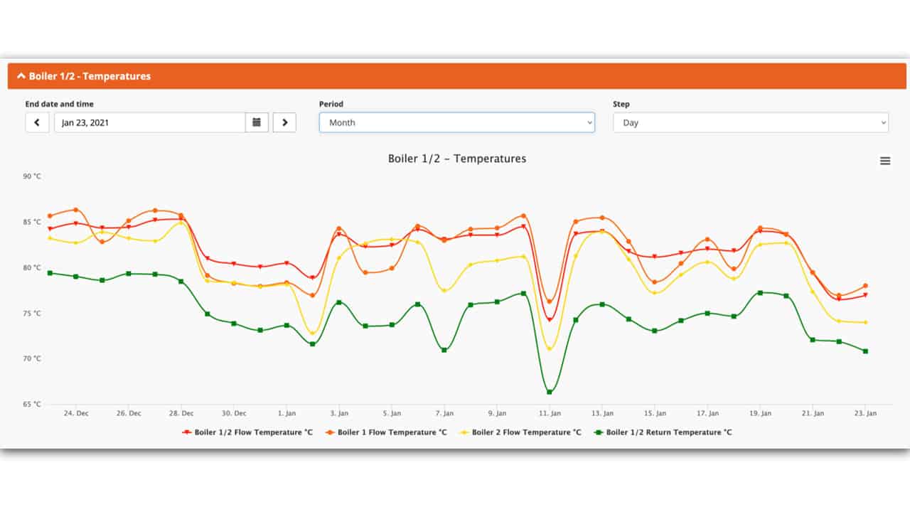
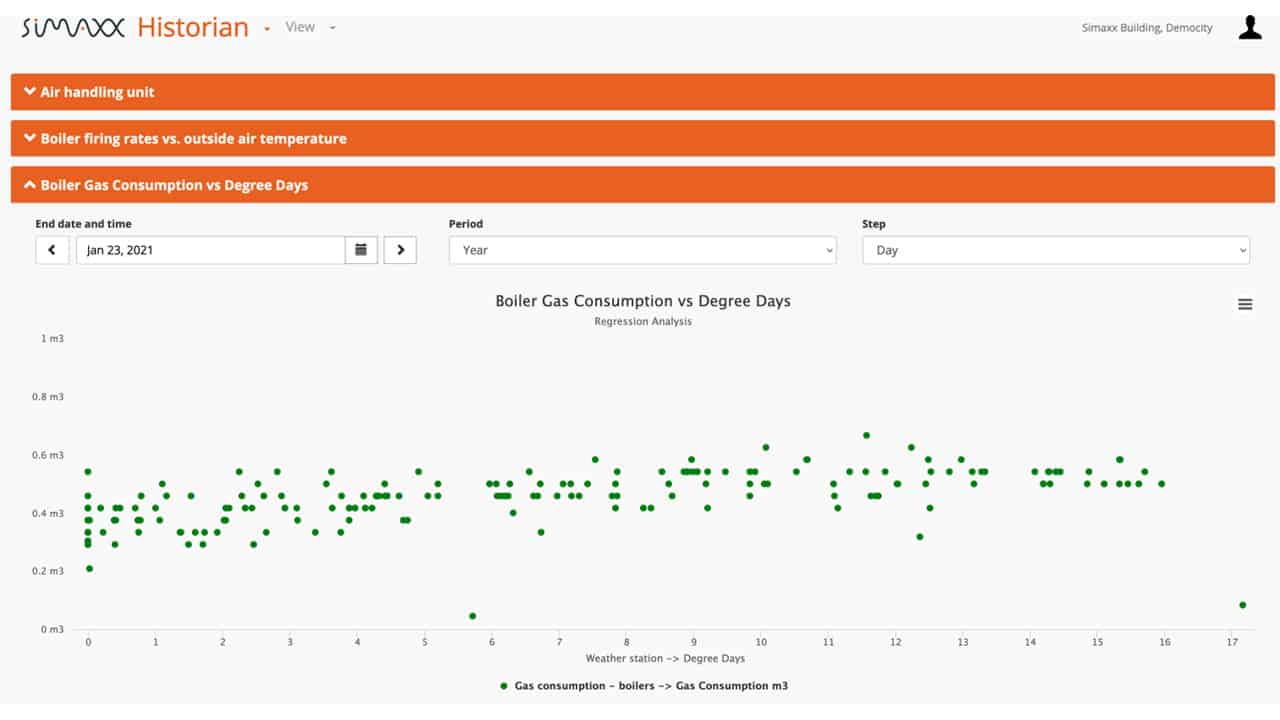
Data is selected using the ‘Date, Period & Step’ boxes, which are common to many Simaxx functionalities. Data is manipulated according to the requirements of the graph, e.g. totalising or maximal, when the ‘Step’ element is changed.
Graph Types
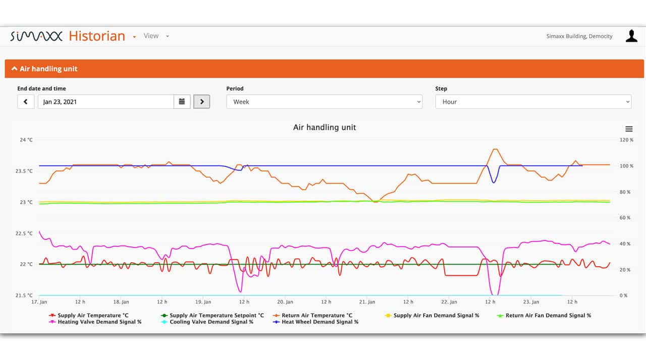
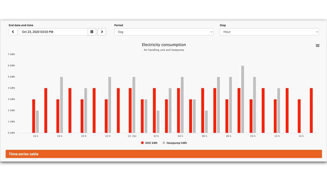
Many different styles of graphs are easily configurable. From basic Line graphs and bar charts to interpolated lines and benchmarking graphs which allow data from previous periods to be compared against current data.
Examples of the different graph styles are shown below.
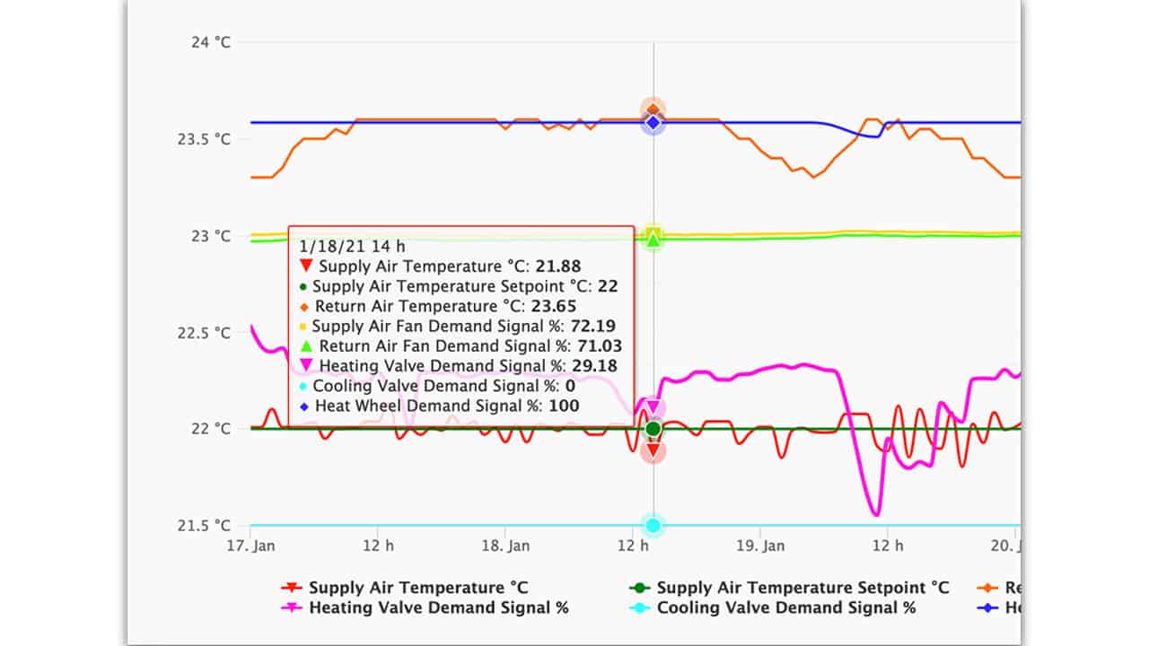
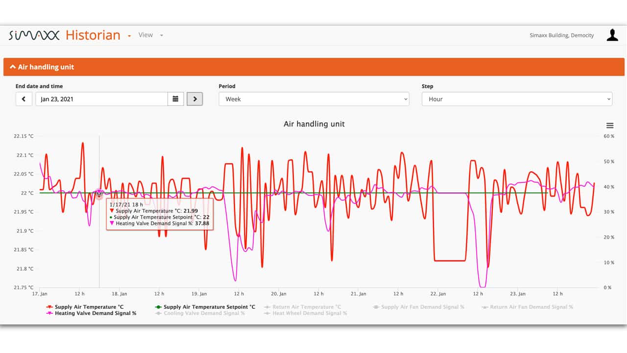
User Assistance
The Historian application offers some useful features to assist the user in making sense of data. As you swipe across the graph, data values appear alongside the name of the trace, so that data sets can be compared against each other. To isolate certain data sets within a graph, the data set can be ‘hidden’ by clicking on the name in the legend below the graph. Swiping a zoom window allows even closer inspection of the graph.